Pages

Wednesday 11 December 2019

UPDATED: 2019 election night - compare results to polls / 2017 election

(Updated on 11th December at 10pm to include 2017 GE election results)

I find that one helpful thing to do when watching election night coverage is to compare the results as they come in to the final (or most authoritative) poll. The networks don't really focus on that analysis; instead, they show you the swing from the last election, which is important, obvs, but not representative of where perceptions are on the night in terms of expectations of the likely result.

So I've made this Tableau tool, which allows you to look up a constituency's predicted vote shares from the second and final Yougov MRP poll alongside the 2017 General Election election results.


Thursday 5 December 2019

MIS MARKET MOVES 2019: the challengers are slowly but steadily catching up

If you've found your way to my blog, you're almost certainly here for in-depth Management Information System (MIS) market analysis accompanied by whizzy graphs, and almost certainly not here for whimsical stories about random encounters in a veterinary surgeon's office in Lausanne.

But tough luck, because something bonkers happened to me yesterday in just that setting, and it's way more relevant to this blog than you'd imagine. So, if you haven't already, pause your excitement to find out about this year's market stats, check out this Twitter thread, and then come back here to read on....

[...]

Oh good, you're back. That was nuts, right?

Anyway, a brief headline of this year's stats is: yep, SIMS is continuing to decline, but nope, it's not happening as quickly as some vendors and commentators have been claiming.

Let's start with churn, since it's frankly the most important metric for understanding the pace of change in the market. Here are three charts that tell you what you need to know (commentary below):


Taking the charts in order:
  1. SIMS churned 3.6% of its school customers in 18/19, up from 3.1% in 17/18. Bear in mind also that this is the culmination of a steady uptick since 2014, when churn was just 0.6%. That's no doubt cause for concern in SIMS Towers, but given some people have been whispering predictions well in excess of this, it's by no means (yet) a sign of precipitous decline. 
  2. What you can see though, is that the market is inexorably changing in favour of the challenger MIS. The top two vendors (SIMS and RM Integris) churned 3.6% and 4.1% respectively, whereas the third (Scholarpack) is churning at under 1%.
  3. However, let's not get carried away. The third chart shows Advanced Learning's churn set against that of SIMS. Advanced are something of a parable of what not to do in MIS-land: they have declined from 1,380 schools in 2010 to just 357 today. (Note to self: the story of why that happened is in itself worth a blog someday.) Things looked fine for them in 2011, when they churned just 2.2% - but the canary in the mineshaft came in 2012 when churn jumped to 7%. It rose to over 10% in 2014, and it has been between 10% and 37% ever since. 
Or, to put it another way, the data implies that mature MIS can churn up to perhaps 5% and just about hold their own. So I'll sound the alarm for SIMS if and when that number gets above the 5% threshold.

OK, now let's move to the market more broadly. Here are a bunch more graphs (again, with analysis below):


You'll see from these that:

  1. SIMS market share is now at 75.1%, down from 77.8% last year when measured in terms of the number of school customers. (The decline is smaller than their churn because they won some schools too.)
  2. RM Integris remains in a clear second place, but also dropped a little (from 2,175 to 2,127 schools), giving further ground to the approaching pack.
  3. Arbor, Bromcom and Scholarpack all continue to gain, with each being able to claim an important distinction. Arbor grew fastest overall, notching up 277 switchers. Bromcom did best best amongst secondaries for the second year running (which also translates into a greater market share when measured by pupils). And Scholarpack remains the biggest of the three challengers on all measures, with 1,233 schools (5.6% market share by schools; 3.8% by pupils).
  4. Pupil Asset and Schoolpod stayed solid, without matching the gains of the other challengers. Pupil Asset grew the most, from 410 to 447 schools, and Schoolpod was more or less static at 134 schools vs 131 last year.
  5. SIMS's losses still are mostly primary-focused, though it's notable that they lost almost twice the number of secondaries in 2019 as they have done in any other year (53, compared to the previous high of 29 in 2018).
  6. Advanced continue to have a rough time. They gained just 10 schools in the year - the lowest of all MIS who won any schools, and lost 46. They're now the 7th largest MIS in terms of the number of school customers (357 vs 397 in 2018). 
  7. Nobody else is making a dent. iSAMS and SchoolBase held on to their handful of schools (they're both much bigger with private schools, mind), and Faronics are still there with one school customer. But nobody else is making a significant dent on the market, and it'll be jolly hard for anyone else to break in to the market now, given the years of hard work it took Arbor, Bromcom and Scholarpack to build their current momentum.

Right, that's enough for now. I may play around with a bit of additional analysis between now and Christmas, so keep an eye out if you'd like to hear more. Ideas are welcome!

Oh, and I recently left Assembly (my day job until earlier this month), and instead I am now:
  1. Starting a new schools venture (we're launching in January - watch this space).
  2. Representing Aircury, an awesome edtech software development agency.  
  3. Doing bits and bobs of advisory work. 
So, if you are struggling to resource your development needs, let's talk! Or, you're a MIS vendor and you'd like additional analysis, get in touch! Or, if you're an investor considering the market, hey, give me a shout! Or if you're a Multi Academy Trust considering what MIS to buy, cool, let's chat! (In the case of MATs I don't normally charge unless there's specific a need for lots of assistance - mainly I just enjoy gossiping about MIS....)

A final disclaimer: while I now have a few friends and/or clients who work for MIS vendors, I always aim to write this blog from a neutral perspective. As such, I generally avoid predictions, and instead focus on relating insights derived from the data. 

Wednesday 31 July 2019

MIS switching picked up in the spring term. Arbor, ScholarPack and Bromcom led the way.

This is a quick blog update as I've just received the school summer census MIS numbers, and  there are some interesting points to note. But also... it's barely any time since my previous post based on the Spring census, so I'm not indulge in all the normal Tableau whistles and bells.

Instead, here are the headlines. Between the 2019 Spring and Summer censuses:

  • 420 schools switched MIS. That's a lot in historical terms for one term - and more than switched in an entire academic year between 2010-11 and 2013-14. 
  • 613 schools have switched so far this year. Last year 860 schools switched - itself the highest for a decade - and 2018-19 now looks on track to beat this.
  • Arbor, ScholarPack and Bromcom all did well. Arbor had the most switchers (125), followed closely by ScholarPack (115) and Bromcom (99). However, if you measure switching by pupil numbers, Bromcom was out in front (46,769 new pupils), followed by Arbor (34,790) and ScholarPack (28,008). 
  • SIMS lost 350 schools - a 2.1% churn. To put this in context, that figure (for one term) is higher than their churn in any full year over the past decade with the exception of 2017-18, when they churned 2.9%. Moreover, in the two terms of 2019 combined they've already churned 2.9%, meaning they're on track for another year of increased churn. Their market share (by number of schools) is now 75.8%, down from 77.3%.
  • Arbor is now the fourth largest vendor by numbers of schools; Bromcom is fourth largest by pupil numbers. The pecking order by schools is now: SIMS (75.8%), RM Integris (9.7%), Scholarpack (5.5%), Arbor (2.5%), Pupil Asset (2.0%), Bromcom (2.0%), Advanced (1.7%), SchoolPod (0.6%). By pupil numbers it's SIMS (79.9%), RM Integris (7.0%), ScholarPack (3.7%), Bromcom (3.0%), Advanced (2.6%), Arbor (1.9%), Pupil Asset (1.1%), SchoolPod (0.4%).
Below are the tables showing the Spring and Summer census 2019 figures for the raw data aficionados out there. If you have any other questions, say hi on Twitter or LinkedIn.


Saturday 13 July 2019

MIS MARKET MOVES: Large MATs Are Changing The Way Schools Buy MIS

I've spent the last couple of weeks playing with the latest (Jan 19 census) school MIS data. When I first tweeted about it my headline was "NOT MUCH CHANGED". That's because a relatively underwhelming 193 English schools switched MIS - so you'd be forgiven for assuming there isn't much happening in the market.

But then I decided to dig into the data and look at the effect of Multi Academy Trusts (MATs) on MIS commissioning, and I came across some eye-opening trends.

It is now clear that MATs are at the forefront of school MIS switching. Moreover, the larger the MAT, the more likely you are to switch. Take this nugget: the 846 schools in MATs with 30+ schools represent under 4% of all English state schools, but over the past term they represented 36% of all school switchers. That's a 9% churn for the "largest MATS" segment rate IN ONE TERM!

And if you think I've cherry-picked my data to make the trend look more pronounced than it really is, try this: over the past 3 and a third years, 377 of those 846 schools have switched MIS, equivalent to a churn rate of 13.3% per annum. That's 45% of ALL the schools in the largest MATs over the period switching their MIS! When you consider that over that same timeframe the non-academy churn was 2.2% per annum, you get a sense of just how proactive the largest MATs have been at switching compared to other schools.

Anyway, it's fun to be able to explore the data for yourself, so here are the visualisations I think say the most about where the market is right now...


Here are a few further thoughts on what those vizzes show:

  • 10+ school MATs dramatically outswitch smaller MATs and standalone academies / non-academies. They represent just 15% of all schools but a third of all switchers over the past 3 and a third years. That makes sense to me - once you have 10+ schools, you're more likely to have a  COO or procurement lead who'll like the six (or even seven) figure savings that can be achieved over a contract period by switching MIS. 
  • Churn rates are likely to increase in the coming years. Given that a further expansion and consolidation of MATs is likely, and since larger MATs can signal the direction of the sector more broadly, the overall churn rate is also likely to increase. 
  • The larger the MAT, the less you see of SIMS. If you look at the fourth viz in the above set, you'll see a chart showing vendor market share from 2014 onwards, segmented by MAT size. I've set the default to exclude non-MAT schools, and you can see that SIMS's market share has declined by 12 percentage point over the period with all MATs. Moreover, as you untick size categories (starting with the smallest), you notice that each time you do so the SIMS market share drops. For the largest MATs their market share is barely half of schools.
  • Then again, SIMS market share hasn't budged one bit if you count by pupil numbers. Before anyone gets giddy about those rates of change, take a look at the penultimate viz in the set. You'll see that when the market is measured by pupil numbers, in 2010 SIMS had a market share of 81.06%, whereas in Jan 2019 their market share had moved on to (*checks notes*)... 81.06%. How have they managed this? Well, their decline is predominantly with primaries, where their market share has dropped from 82% to 76% of all schools. However, over that period they've actually grown their secondary share from 80% to 89% (largely at the expense of Advance Learning, whose CMIS product has consistently lost share over that period). On which note... 
  • The primary MIS market is now pretty competitive... RM, Scholarpack, Arbor, Pupil Asset, Advanced Learning and Bromcom all have c. 1%+ of the primary market, and together they share a quarter of all schools. What's more, when primary schools have switched over the past 16 months, over three quarters have been moving away from SIMS. That's important, because for the challengers it means any increase in churn will likely equate to an equivalent net increase for them.
  • ...Secondaries, not so much. SIMS's (89% of secondaries) has just two serious competitors as things stand: Advanced Learning (4.7%) and Bromcom (4.5%). Furthermore, with Advanced losing share every year for the past decade (down from 17.6% in 2010), it's really only Bromcom eating into their totals to date. That may change - Arbor's CEO tweeted at me recently to point out they now work with 73 secondary schools, and it seems clear their ambitions are to make a much bigger dent in that market. But based on the available data, if you're a secondary, you're probably sticking with SIMS for now.

NOTE: In my day job with Assembly (now a Groupcall company), we're friends and partners of all  MIS vendors in some way. However, we don't see it as our place to "pick winners" when it comes to school MIS selection, so my aim with this blog is to present data objectively to increase market understanding. 

Wednesday 22 May 2019

Here are nine shonky data practices that I've seen in schools. How many are you guilty of?

This Education Datalab tweet got me thinking.

It's a cracking exposé of sixteen (unnamed) schools which appear to have multiple students who are be on roll in autumn, off roll in spring and then on roll in summer. While we can't be certain of the intention, it seems highly likely that the goal is to exclude these students from the school's official KS4 accountability measures, since eligibility is based on pupils in Year 11 in the spring school census.

I tweeted this after reading the blog:
I stand by the sentiment, but ever since I've had the lingering sense that maybe we have all been complicit in something really silly that helps a school game data, wittingly or unwittingly. And maybe we'd all do that a bit less if, as well as condemning fairly obvious malpractice, we also pause and think about our own more subtle mistakes.

So in that spirit, here are nine shonky data practices I'm aware of. I'm mostly (and deliberately) drawing on things I've witnessed in schools that I've not been involved with directly - either as a member or staff or as a software supplier (I get to see a lot of schools so I'm lucky that way). And, for the avoidance of doubt, my former employer Ark had a great, self-reflective data culture. In the grey areas I talk about below I generally felt Ark were striving to do the right thing. But in any case, this isn't about shaming: it's about facing up to the things we could all do more to understand, or change...

Nine shonky data practices I've seen in schools
  1. EYFS results that are surely too good to be true. This may be more likely in new start schools - they only have one year group when they start, so there's extra focus on the data, and it's all Teacher Assessed (TA) data anyway and they're SO YOUNG and changing SO FAST so... somehow things get rounded up.
  2. KS1 TA results that are significantly more optimistic than the actual SATs papers taken at the same time. (For those that don't know, students sit KS1 exam papers, then schools basically throw those away and instead submit Teacher Assessed results. But that's an oddity for another day.) I once sat down with a head and talked through anonymised TA and scaled score data. If memory serves, there was one child was given a TA result lower than the SATs score implied. 17 were given higher TA results. Again, in my limited experience you're more likely to see this kind of thing in new start primaries or infant schools where KS1 is the ultimate outcome, so higher scores are good. Which brings me to...
  3. KS1 TA results that are significantly more pessimistic than the actual SATs papers taken at the same time. I once sat down with a highly impressive head of school who asked me how Ark handled KS1 results, because their schools submitted TA results on the pessimistic side. Basically their judgments were the mirror opposite of the case outlined in (2). This individual was claiming they were doing it to be "cautious", and  therefore somehow responsible, but then I looked at their progress scores and (surprise!) they do really well in that regard. So... why the need to be cautious? Just be as accurate as possible!
  4. Phonics results that follow this pattern. And that's... not how a distribution of results should look. In a national context it's easy to find it almost comical - but maybe it's also worth checking your own school's "curve" - and then see if you're still laughing when you realise how few of your students scored 31 (32 is usually the pass mark - and by now, schools have cottoned on.) 
  5. KS2 SATs results that seem to flatter the school. I've read about this more than I've seen it, and having never worked directly in a school I've never been involved in SATs invigilation, so I can't really put my finger on what it looks like when teachers help their students during the SATs exams. But, as this fascinating 2018 Schools Week article by the ever-excellent Laura McInerney explained, another Education Datalab study identified 30 schools where the pupils, "for whatever reason, do extremely well in their SATs exams and then bomb at secondary."
  6. Internal attainment data that looks ropey in autumn, better in spring and wonderful in summer. When schools report data from years that are not assessed statutorily, there is not always a way to sense-check what's being reported. But teachers may well be having their performance management based on their class's data. So it would make sense if the kids kind-of got better during the year, wouldn't it?
  7. Internal attainment data where the grades imply a common language but the teachers are clearly assessing differently. This is perhaps the most common - and innocent mistake. If you manage assessment across a MAT, it's hard to know whether every teacher is using the same methodology to arrive at an assessment. Even where there's a standardised assessment, some schools are probably getting the kids to sit in a hall, and others are just building the test into normal classroom practice. 
  8. Internal attainment data which looks good until the summer term of year 5 / year 10 then gets progressively worse during the "accountability" year. I've seen this multiple times now. I guess the cognitive bias is that people tend to be more likely to declare bad news when they're closer to the moment of reckoning.
  9. KS4 students who disappear from roll in the final year. The Education Datalab story highlighted a particularly cynical example of this, but the more common approach appears to be where a student just disappears from roll during the year, never to return. That's clearly bad for the life chances of the child in question - and accountability would seem to be a driving factor behind the behaviour.
This list isn't exhaustive, but there's hopefully enough there to make you reflect on your own experiences.

So what can we all do to be better? Well, if you're a governor, head, data manager or other school or MAT staff member, I'd suggest starting with the following:
  1. Read up. Look at any and all of the following:
    1. Making Good Progress by Daisy Christodoulou 
    2. Measuring Up by Daniel Koretz
    3. Every blog post Jamie Pembroke has ever written
    4. School-specific assessment courses from Evidence Based Education 
  2. Don't assume data you're presented with is correct. I mean, it may be of good quality, but take time to find that out. How has it been moderated? Were standardised assessments used for calibration? If it is test data, what conditions were the tests sat in? Are they working at grades or predictions? Is it even clear what the different between those two things is? This is particularly relevant for governors. I have to assume I'm not the only person who felt a bit useless in a governance role at some point. It's hard to know how to intervene effectively, and the head seems so... on it! Well, a few well placed and persistent questions about data accuracy can make all the difference. Keep asking about data reliability and process until you're confident everything is kosher. Ask to see any available correlations (e.g. TA vs KS1 SATs; internal assessments vs standardised assessments etc). Ask to see your phonics results graphed, so you can see whether a surprisingly large number of students just made the pass mark, while hardly anyone scored just below it. Make sure you know your off-rolling numbers and the reasons why students have been off-rolled. If people don't look happy that you're asking, take it as a sign that you're on to something until proven otherwise...
  3. Put a "commitment to accuracy" in your assessment policy. I know, it's just words. But I'm a believer in simple policies or statements (one page could be enough) to align behaviours. It only takes one sentence. Just say something like: "We will at all times aim for an accurate reflection of reality in our assessments, and will be vigilant never to skew our judgments positively or negatively to suit a perceived agenda". 
  4. Call bullshit. This is easy for me to say (because I'm not involved in running schools anymore) - but the leaders I've admired most on data do this even when they're in a position of accountability. The first person to show me that Phonics graph I mentioned in point 4 above (albeit a slightly earlier version) was Amanda Spielman, in an Ark meeting (we both worked there at the same time), as we grappled with whether to trust our own network's data. Daisy Christodoulou also led the charge for more honesty about whether our data could be more reliable at Ark, and her crystal-clear thinking led to the a move towards prioritisation of standardised assessments. Both were outstanding at calling bullshit. And hey, their careers seem to be working out ok... so don't be afraid to point out the nonsense and lobby for greater reliability!

Thursday 3 January 2019

MIS MARKET MOVES 2018: three signs that market activity is increasing

If you've paid any attention to the School Management Information Systems (MIS) market in English state schools over the past decade, you'll know that it moves slowly. Capita SIMS have dominated, with around four fifths of the market, leaving others feeling at times like they're competing for scraps.

However, in the last year or two, there have been signs that things are starting to change. A number of cloud MIS vendors emerged as serious options for schools of all shapes and sizes. This led to 860 schools changing supplier in 2017 (or 4%) of the market; a significant increase on previous years.

So now that the DfE has released autumn 2018 data, the big question is: is the rate of change picking up?

Well, a first glance at the data suggests the answer is "not yet", with the number of schools switching dropping slightly over the year to 740. HOWEVER, I think that conclusion would be misleading... and so what follows are my three main takeaways from analysing the data, all of which could point to a potentially marked increase in market activity over the coming year.

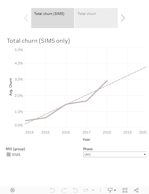
1) Overall churn hasn't risen, but the most important number has, and by quite a lot.
Churn has never risen above 4% in the past eight years. Or, to put it another way, at most 1 in 25 schools decides to change its MIS in any given year, based on recent trends (see below).


This maddens the challenger MIS vendors, of course. Everyone knows that Capita SIMS has the lion's share of the market, so getting a major foothold requires other to eat into that share. But how can they do that when schools aren't switching?

Well, that brings me to the first intriguing trend (see viz below).


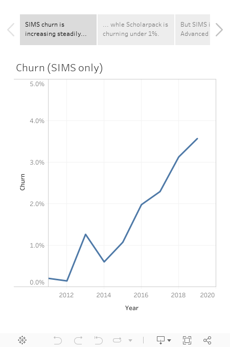
As you'll see from this first viz, The SIMS churn rate has increased for five years straight, from 0.4% in 2014 to 2.9% today. The highest it ever was before this year was 1.7%. And that's for all schools; if you look at primary only, the rate has gone from 0.7% in 2014 to 3.5% today. On current trends, churn from SIMS alone would be 4% of all schools by 2020, and 5% for primaries.

If you click on the other tab on this viz, you'll see the churn for all vendors. What becomes clear here is that until this year, churn was driven primarily by two factors:
  1. Smaller vendors leaving the market (first Pearson e1, then Wauton Samuel).
  2. The decline in the share of products owned by Advanced Learning (and Serco before them). 
Strip out those one-off changes, however, and there really wasn't much happening, at least until this year. So the rise in SIMS churn will give cheer to the challenger brands. At 2.9% churn, SIMS is certainly not going anywhere; but the others will finally see in this number a real opportunity to compete.

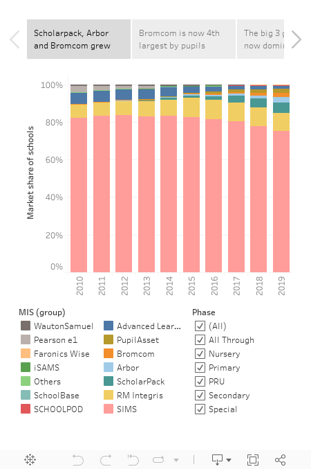
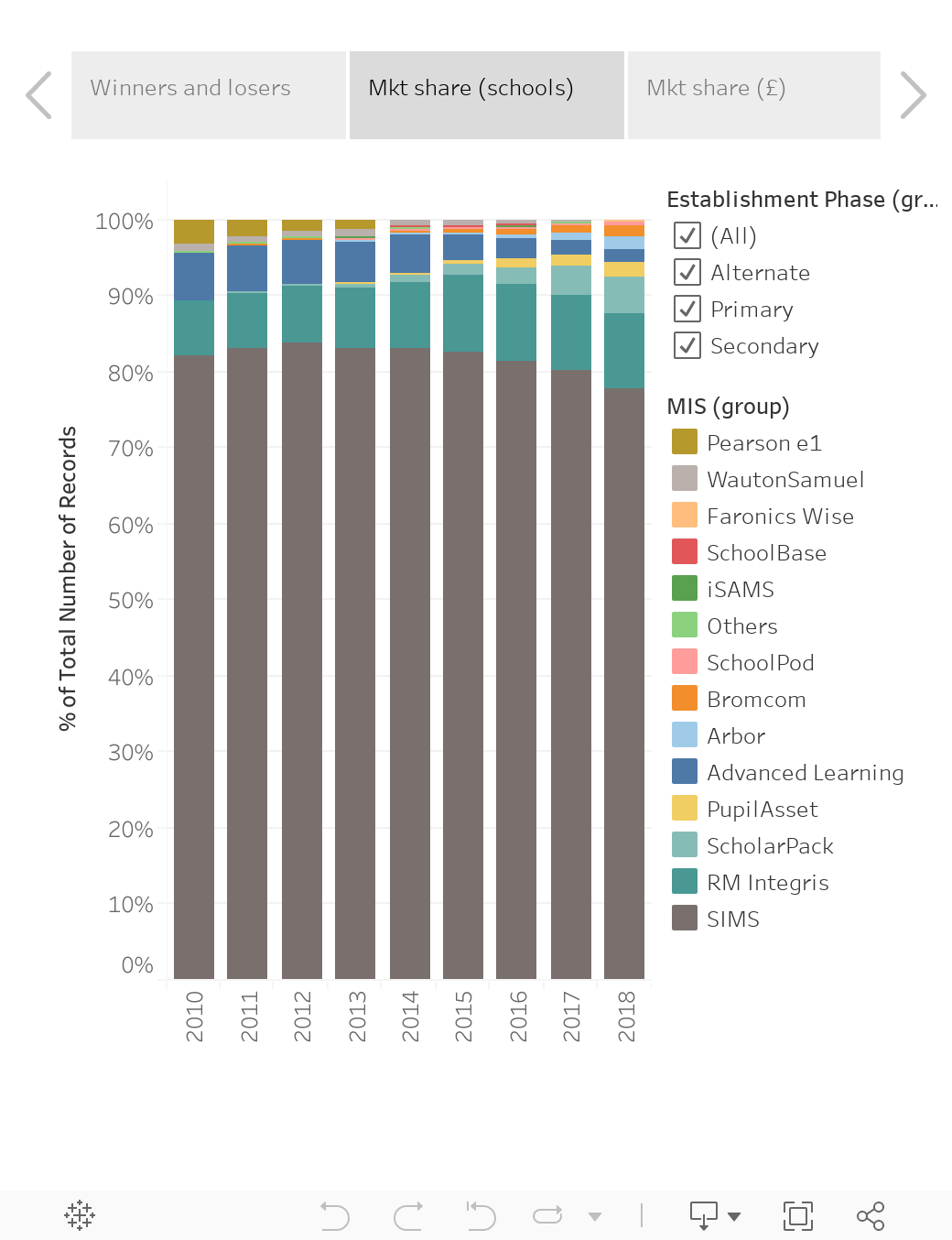
2) There's now a top tier of seven well-established vendors.
In 2010, there were only four notable vendors: SIMS, CMIS (then Serco; now part of Advanced Learning), RM Integris and Pearson e1. There wasn't even a long tail of plucky challengers - Wauton Samuel had a little area of the south east sewn up; but otherwise,  that was your lot.

Fast-forward to 2018, however, and you find seven vendors competing for your school's business, and they're all either well established or growing. Those are (in order of market share): SIMS, RM Integris, ScholarPack, Pupil Asset, Advanced Learning, Arbor and Bromcom.

In the next viz,  as well as listing the wins/losses/market share numbers, I've also included a (very rough) estimate of market share in terms of Annual Recurring Revenue (ARR). What it shows is that these seven are all likely to have ARR of £1m+. I think that's important, as a level of financial strength is required if a product is going to be able to pay for further development and iteration. One other notable insight from the Market share by revenue analysis is Bromcom is a bigger outfit than some give them credit for. This is because their market share skews more towards secondary schools, who typically pay a lot more for their MIS, because of both higher pupil numbers and higher per-pupil pricing, linked to their more complex requirements. By my estimates, Bromcom have c. 2.5% of the total market by revenue, compared to 1.3% by number of schools.

This points to a broader insight, which is that these seven vendors have their own subtle differentiators. As I wrote in my July 2018 post, MATs continue to dominate among switchers, so their needs are getting a lot of attention. The primary sub-sector is also seeing increased switching, and there's a lot of competition for that business. And for the first time ever, someone other than SIMS won the largest number of switching secondaries: Bromcom gained 40 secondaries in the past year, compared to 33 from SIMS. (A hat tip also to Pupil Asset, Arbor, Advanced, RM Integris and iSAMS, who all added secondaries, albeit in the single digits.)

Finally, an honourable mention goes to SchoolPod (part of EduSpot), who grew to 131 schools. They are particularly popular with Alternate Provision and Special schools, not all of whom report their census in the conventional way, so it's also quite likely their share is larger (probably also above 1% by number of schools) once that is taken into consideration). So in some ways, it may be fairer to say there are eight notable vendors in the market right now.


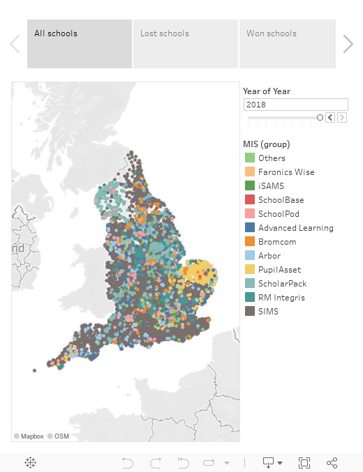
3) Your local schools use a variety of MIS!
A colleague of mine asked me if I could do a viz showing the geographical spread of MIS choice, ideally with a slider so the change over time could be perceived. So I gave it a go, and I'm glad I did, because while playing with the data I spotted a fascinating change.

If you look at the map in the final viz below, and wind back in time from 2018 to 2010,  you'll see that the dominance of SIMS is less pronounced in recent years. Then, to understand why this is in more detail, exclude SIMS from the viz. (To do this, choose them from the legend, then select "Exclude"). What jumps out in 2010 is that the challenger vendors each had little toe-holds around the country, but nothing more. Pearson had Norfolk; Wauton Samuel had their South Eastern patch; and Integris and Serco (now Advanced) each had five or six strongholds. That was essentially that. Local Authorities were still the main purchasers, and this led to regional consistency. However, if you then scroll back from 2010 to 2018 with SIMS excluded, what becomes clear is that challenger MIS are now everywhere.


The growth of MATs has increased the geographic diversity considerably, but more broadly it's also a self-perpetuating trend. In the old days, if you spent your life working in one LA, chances are you'd only know one MIS, regardless of which school you worked at. Nowadays, however, you might have five or six different MIS being used in neighbouring schools. That creates more familiarity with alternatives, and with that comes a willingness to consider options.

So to summarise, the market isn't changing quickly (yet), but it is healthier than it has been for a long time, and the rate of change seems set to increase in coming years.

NOTE: In my day job with Assembly, we're friends and partners of all the major MIS vendors in some way, and we now have deeper commercial partnerships in place with RM Integris and ScholarPack specifically. However, we don't see it as our place to "pick winners" when it comes to school MIS selection, so my aim with this blog is to present data objectively to increase market understanding. I avoid adding anything that could be construed as subjective speculation or opinion.