It's a cracking exposé of sixteen (unnamed) schools which appear to have multiple students who are be on roll in autumn, off roll in spring and then on roll in summer. While we can't be certain of the intention, it seems highly likely that the goal is to exclude these students from the school's official KS4 accountability measures, since eligibility is based on pupils in Year 11 in the spring school census.
I tweeted this after reading the blog:
I stand by the sentiment, but ever since I've had the lingering sense that maybe we have all been complicit in something really silly that helps a school game data, wittingly or unwittingly. And maybe we'd all do that a bit less if, as well as condemning fairly obvious malpractice, we also pause and think about our own more subtle mistakes.If you work in a school and your approach to data involves gaming the system you've got the wrong approach to data.— Joshua Perry (@bringmoredata) May 22, 2019
(Also: 👏👏👏 to @FFTEduDatalab for spotting this) https://t.co/JAE9KaLkOB
So in that spirit, here are nine shonky data practices I'm aware of. I'm mostly (and deliberately) drawing on things I've witnessed in schools that I've not been involved with directly - either as a member or staff or as a software supplier (I get to see a lot of schools so I'm lucky that way). And, for the avoidance of doubt, my former employer Ark had a great, self-reflective data culture. In the grey areas I talk about below I generally felt Ark were striving to do the right thing. But in any case, this isn't about shaming: it's about facing up to the things we could all do more to understand, or change...
Nine shonky data practices I've seen in schools
- EYFS results that are surely too good to be true. This may be more likely in new start schools - they only have one year group when they start, so there's extra focus on the data, and it's all Teacher Assessed (TA) data anyway and they're SO YOUNG and changing SO FAST so... somehow things get rounded up.
- KS1 TA results that are significantly more optimistic than the actual SATs papers taken at the same time. (For those that don't know, students sit KS1 exam papers, then schools basically throw those away and instead submit Teacher Assessed results. But that's an oddity for another day.) I once sat down with a head and talked through anonymised TA and scaled score data. If memory serves, there was one child was given a TA result lower than the SATs score implied. 17 were given higher TA results. Again, in my limited experience you're more likely to see this kind of thing in new start primaries or infant schools where KS1 is the ultimate outcome, so higher scores are good. Which brings me to...
- KS1 TA results that are significantly more pessimistic than the actual SATs papers taken at the same time. I once sat down with a highly impressive head of school who asked me how Ark handled KS1 results, because their schools submitted TA results on the pessimistic side. Basically their judgments were the mirror opposite of the case outlined in (2). This individual was claiming they were doing it to be "cautious", and therefore somehow responsible, but then I looked at their progress scores and (surprise!) they do really well in that regard. So... why the need to be cautious? Just be as accurate as possible!
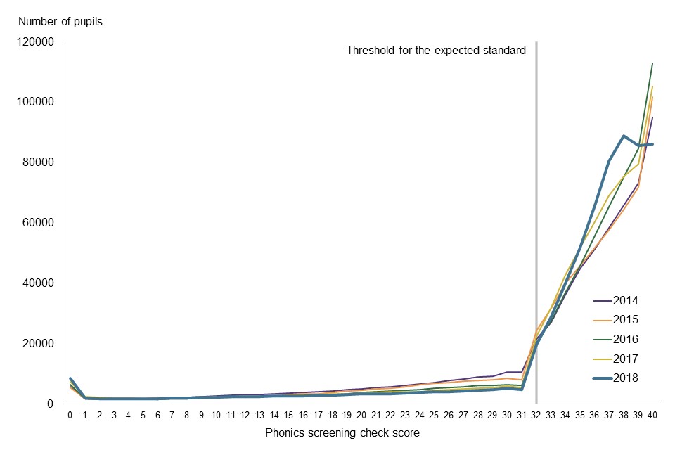
- Phonics results that follow this pattern. And that's... not how a distribution of results should look. In a national context it's easy to find it almost comical - but maybe it's also worth checking your own school's "curve" - and then see if you're still laughing when you realise how few of your students scored 31 (32 is usually the pass mark - and by now, schools have cottoned on.)
- KS2 SATs results that seem to flatter the school. I've read about this more than I've seen it, and having never worked directly in a school I've never been involved in SATs invigilation, so I can't really put my finger on what it looks like when teachers help their students during the SATs exams. But, as this fascinating 2018 Schools Week article by the ever-excellent Laura McInerney explained, another Education Datalab study identified 30 schools where the pupils, "for whatever reason, do extremely well in their SATs exams and then bomb at secondary."
- Internal attainment data that looks ropey in autumn, better in spring and wonderful in summer. When schools report data from years that are not assessed statutorily, there is not always a way to sense-check what's being reported. But teachers may well be having their performance management based on their class's data. So it would make sense if the kids kind-of got better during the year, wouldn't it?
- Internal attainment data where the grades imply a common language but the teachers are clearly assessing differently. This is perhaps the most common - and innocent mistake. If you manage assessment across a MAT, it's hard to know whether every teacher is using the same methodology to arrive at an assessment. Even where there's a standardised assessment, some schools are probably getting the kids to sit in a hall, and others are just building the test into normal classroom practice.
- Internal attainment data which looks good until the summer term of year 5 / year 10 then gets progressively worse during the "accountability" year. I've seen this multiple times now. I guess the cognitive bias is that people tend to be more likely to declare bad news when they're closer to the moment of reckoning.
- KS4 students who disappear from roll in the final year. The Education Datalab story highlighted a particularly cynical example of this, but the more common approach appears to be where a student just disappears from roll during the year, never to return. That's clearly bad for the life chances of the child in question - and accountability would seem to be a driving factor behind the behaviour.
This list isn't exhaustive, but there's hopefully enough there to make you reflect on your own experiences.
So what can we all do to be better? Well, if you're a governor, head, data manager or other school or MAT staff member, I'd suggest starting with the following:
- Read up. Look at any and all of the following:
- Making Good Progress by Daisy Christodoulou
- Measuring Up by Daniel Koretz
- Every blog post Jamie Pembroke has ever written
- School-specific assessment courses from Evidence Based Education
- Don't assume data you're presented with is correct. I mean, it may be of good quality, but take time to find that out. How has it been moderated? Were standardised assessments used for calibration? If it is test data, what conditions were the tests sat in? Are they working at grades or predictions? Is it even clear what the different between those two things is? This is particularly relevant for governors. I have to assume I'm not the only person who felt a bit useless in a governance role at some point. It's hard to know how to intervene effectively, and the head seems so... on it! Well, a few well placed and persistent questions about data accuracy can make all the difference. Keep asking about data reliability and process until you're confident everything is kosher. Ask to see any available correlations (e.g. TA vs KS1 SATs; internal assessments vs standardised assessments etc). Ask to see your phonics results graphed, so you can see whether a surprisingly large number of students just made the pass mark, while hardly anyone scored just below it. Make sure you know your off-rolling numbers and the reasons why students have been off-rolled. If people don't look happy that you're asking, take it as a sign that you're on to something until proven otherwise...
- Put a "commitment to accuracy" in your assessment policy. I know, it's just words. But I'm a believer in simple policies or statements (one page could be enough) to align behaviours. It only takes one sentence. Just say something like: "We will at all times aim for an accurate reflection of reality in our assessments, and will be vigilant never to skew our judgments positively or negatively to suit a perceived agenda".
- Call bullshit. This is easy for me to say (because I'm not involved in running schools anymore) - but the leaders I've admired most on data do this even when they're in a position of accountability. The first person to show me that Phonics graph I mentioned in point 4 above (albeit a slightly earlier version) was Amanda Spielman, in an Ark meeting (we both worked there at the same time), as we grappled with whether to trust our own network's data. Daisy Christodoulou also led the charge for more honesty about whether our data could be more reliable at Ark, and her crystal-clear thinking led to the a move towards prioritisation of standardised assessments. Both were outstanding at calling bullshit. And hey, their careers seem to be working out ok... so don't be afraid to point out the nonsense and lobby for greater reliability!